
Brand Guidelines
The Binoban brand, in short
Logo, color, typography, and voice essentials for media, partners, and events. For anything not covered here, contact press@binoban.io.
binoban.ioFuture in your hands
Brand Guidelines
Logo, color, typography, and voice essentials for media, partners, and events. For anything not covered here, contact press@binoban.io.

Logo
The Binoban logo pairs the compass-star — built from interlocking diamonds, a nod to the seer reading the stars — with the custom BINOBAN logotype. The wordmark sits inside or outside the shield, giving a set of horizontal and vertical lockups for different placements.
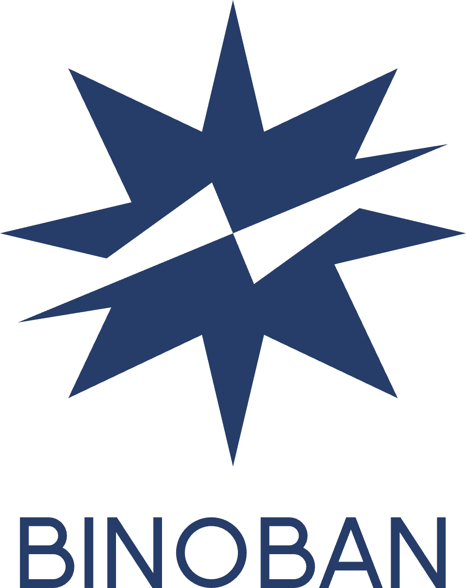
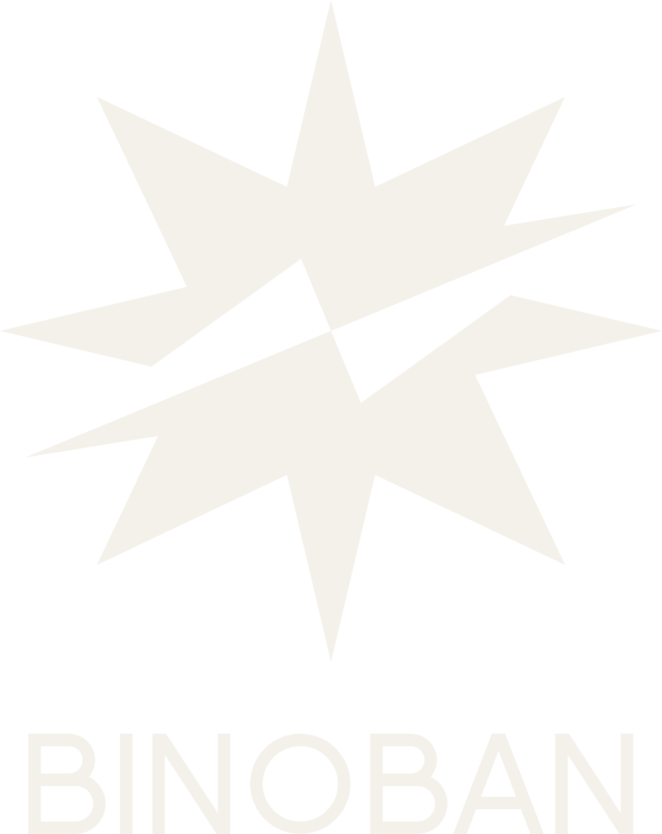
The mark can take any color from the brand palette. It can also be a single-color star with the compass hands picked out in a second palette color.
Use the horizontal or vertical lockup, with the wordmark in or out of the shield. Power and readability of the message always come first.
Color
Navy and gold are primary. Purple, plum, and green are secondary accents. Digital values shown — use the CMYK builds in the Color Book for print.
Typography
Aa Bb Cc 0123
Manrope is the Binoban typeface for Latin text on digital surfaces; Vazirmatn is used for Persian. Use ExtraBold (800) for headlines, Bold (700) for emphasis, and Regular (400) / Light (300) for body copy. The BINOBAN logotype is a custom mark — never reset it as live text.
Voice & Tone
Authoritative yet approachable. Insightful and strategic. Forward-thinking and innovative. Professional and polished — with a subtle sense of foresight and exclusivity.
Slogan